Fundraising dashboards can help you quickly understand the performance of your fundraising efforts. These dashboards are a great way to visualize your data without the need for too many reports.
If you have been on the lookout for fundraising dashboard examples you can use to inspire your own dashboard, look no further. Today, I will be showing you 10 examples of fundraising dashboards that show you how to use dashboards to quickly visualize important data points and statistics.
Some of these examples are actually templates you can take and use for yourself. Others are not templates but are examples; nevertheless, you can take inspiration from them and include some of the same data in your own dashboard, or even set your dashboard up in a similar format.
I made sure to credit the sources. Some of these examples come from dashboard software, so if you like the way a particular dashboard looks, you can sign up to purchase that software and then create a dashboard that looks exactly like the example.
Let us get into it.
Best Fundraising Dashboard Examples
1. iDashBoards Non-Profit Fundraising Dashboard
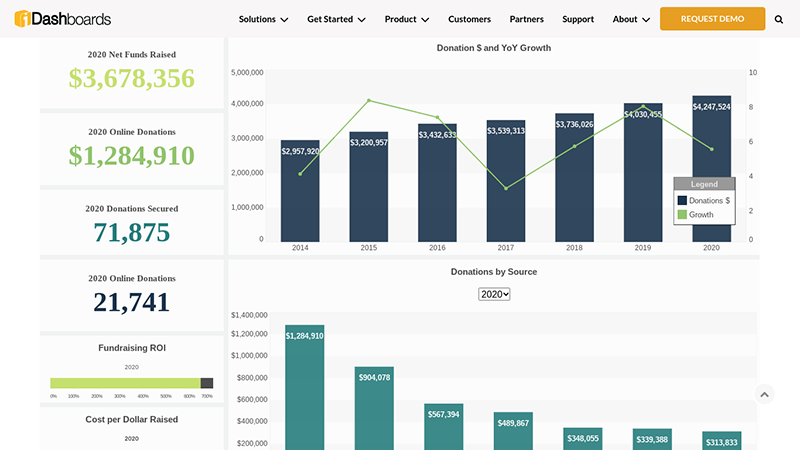
This dashboard is a great example of what to include on a nonprofit fundraising dashboard. It includes several key metrics that are important for your bottom line as a nonprofit with a fundraising mission.
It’s an example dashboard – use it to get an idea of how to set up your own fundraising dashboard, so you can measure your performance.
Here are some of the metrics you can visualize with this dashboard:
- Donations, in dollars
- Year over year growth
- Net funds raised for the past year, including all forms of donations
- Online donations in the past year
- Number of donations made (not number of dollars, but how many times donations were made)
- Number of donations made online
- Fundraising ROI – the total return on investment
- Cost per dollar raised – make sure this is less than one dollar spent on advertising for every dollar raised
- Bar graph displaying donations by source – visualize which donations came from federal funds, which came from donations, which came from grants, and so on
2. Donor Perfect Fundraising Dashboard
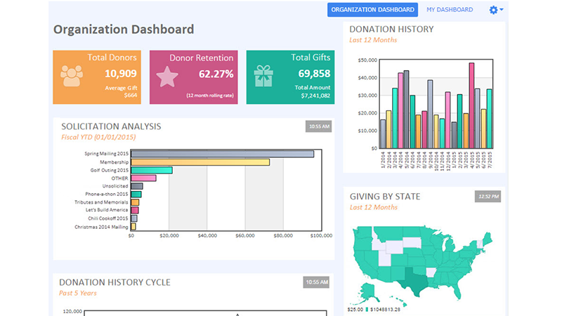
Here’s another example of a fundraising dashboard. This one was generated by Donor Perfect.
Donor Perfect is a software you can use to create a fundraising dashboard. You can choose from 25 different widgets and tiles, some of which you can see in this fundraising dashboard example.
Here is some of the data you can visualize with this dashboard:
- Total donors – How many people donated in total
- Average donation per person
- Donor retention – the percentage of donors who kept donating in a 12 month period (it costs more money to acquire new donors than to retain existing donors)
- Total gifts
- Total amount received in donations
- Gifts received by location – Which states, countries, or regions are bringing in the most donations?
- Donation history graph – When were you getting the most donations?
- Solicitation analysis – How did you acquire your donors? This bar graph shows you the percentage of donors you got from different mailing or marketing campaigns.
- General ledger analysis – Where is your money going, and how are you using your donations (show this to your board)?
3. Get Fully Funded Fundraising Dashboard Template
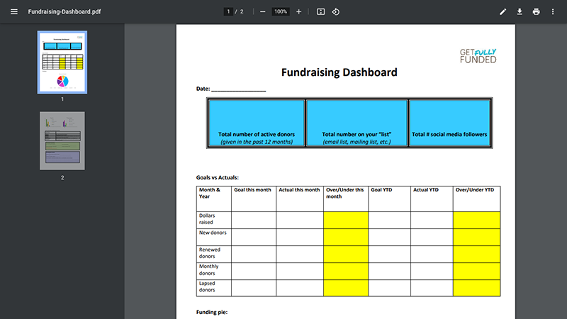
Our third fundraising dashboard example comes from the folks over at Get Fully Funded. This dashboard is actually a template you can use yourself, for your own organization – shout out to Get Fully Funded.
Here is the data you can see in this dashboard:
- Total number of active donors in the past 12 months
- Total number of potential donors on your lists (such as your email list or a physical mailing list)
- Total number of social media followers
- Goals chart – how close you are to achieving your goals. You will see your goals vs actual achievements and how much over or under your goals you are (for the current month and YTD) for:
- Total dollars raised
- New donors gained
- Number of returning donors
- Monthly donors total
- Lapsed donors (donors who did not renew their donations/subscriptions)
- Revenue source pie chart – see the percentage of your fundraising coming from events, grants, campaigns, etc.
- Events bar chart – what types of events you held (auctions, galas, etc.)
- Campaigns bar chart – types of campaigns you held (anniversary campaigns, etc.)
- Event summary – see your statistics for specific events, including:
- How many people came
- How much revenue you received in donations
- Total expenses spent for the event, including marketing
- Net gain (revenue minus expenses)
- Other benefits you gained
- Things you lost or drawbacks of holding that event
- Volunteer summary – see statistics for your volunteers, including:
- Total hours donated by volunteers
- Total volunteers active
- Number of lost volunteers
- PR report card
- Speaking gigs this month
- Number of people reached
4. Sage Intacct Fundraising Dashboard
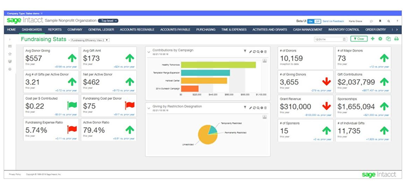
The Sage Intacct Fundraising Dashboard comes to us from Sage Intacct, a financial management software tool.
Using the Sage Intacct Fundraising Dashboard, you can view metrics and key performance indicators like:
- Average donation amount, in dollars
- Average number of donations made per donor
- Net revenue per donor
- Acquisition cost per dollar in donations (the less, the better)
- Acquisition cost per dollar (must be less than the average net revenue per donor)
- Active donor ratio
- Total number of donors (lifetime)
- Total number of major donors
- Total number of donors this year
- Total gift contributions, in dollars
- Grant revenue, in dollars
- Sponsorships, in dollars
- Number of sponsors
- Number of individual gifts
- Bar graph showing active contributions by campaign
5. Tableau Nonprofit Fundraising Dashboard
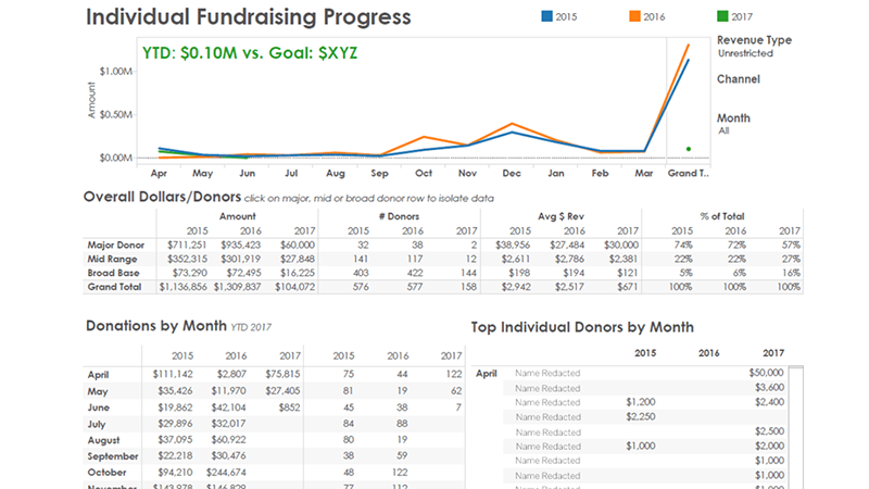
Tableau is a software service that helps businesses and organizations track and visualize data. Their nonprofit fundraising dashboard example is a great example of a dashboard you can use to visualize and track data.
Here is some of the data you can track with this dashboard:
- Donations by month, in dollars
- Top individual donors each month
- Total number of dollars raised by type of donor (major donors, mid-range, and bread base donors)
- Total number of donors, overall and in each of the three above categories
- YTD fundraising progress, and how your achievements measure up to your goals
6. Fundraising Report Card Fundraising Dashboard Template
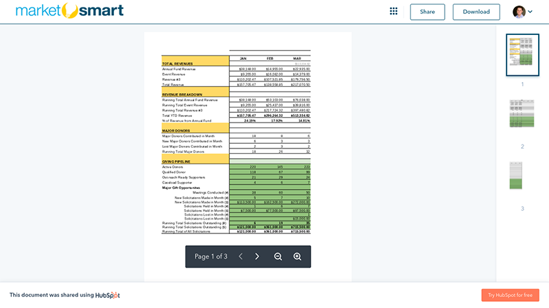
Here’s another sample dashboard template that you can use for your own nonprofit organization, from the folks over at Fundraising Report Card. Shout out to them and their Fundraising Report Card app.
The dashboard is rather simple, but it allows you to effectively track key metrics and KPIs. Here are some of the things you can track using this dashboard template:
- Total revenue, including:
- Annual revenue
- Event revenue
- Other revenue
- Revenue breakdown – where you are getting your revenue from
- Major donor breakdown
- New major donors
- Lost major donors
- Total active major donors this month
- Giving pipeline
- Active donors
- Qualified donors
- Outreach ready supporters
- Caseload supporters (all these are not active donors, but they are potential donors)
- Major gift opportunities, including solicitations made and meetings conducted with donors
7. The Beyond Cash Fundraising Dashboard
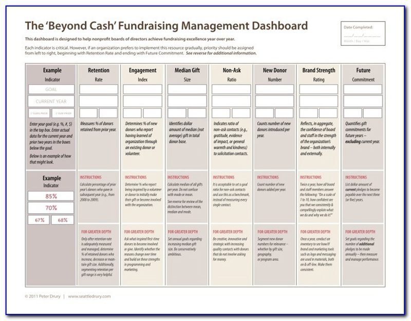
I found this fundraising dashboard example on the Vince Gray 2014 blog. The original source is Peter Drury, but it seems as if that site is no longer online.
It goes beyond just money and helps you get an overview of your overall fundraising performance.
Here are some of the things you can track using this Beyond Cash fundraising dashboard:
- Retention rate
- Engagement index
- Median gift size
- New donors
- Brand strength
- Future commitments from donors
Although this is a pretty bare-bones dashboard, you might find it somewhat useful in looking beyond just the numbers and into things like nonprofit brand awareness.
8. Power BI Charity Dashboard Example
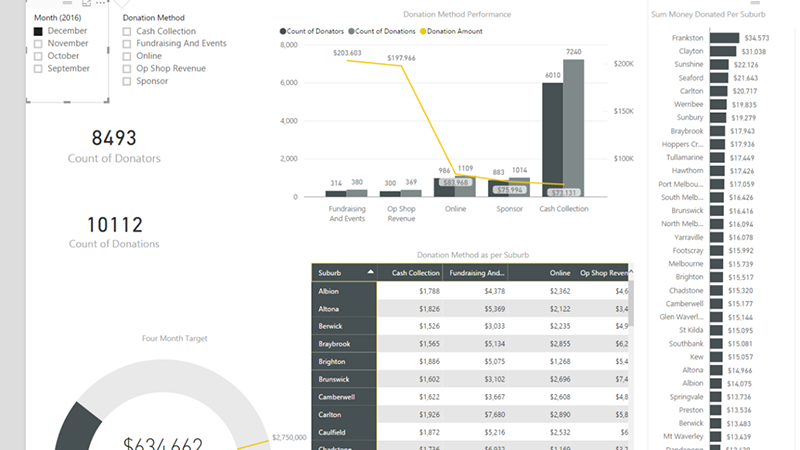
This Power BI dashboard example comes courtesy of Daniel’s Coding Blog. It tracks metrics like:
- Number of donors
- Number of donations
- Donation method/source, such as online, cash, events, etc.
- Donation source breakdown per region/city/suburb
- Total revenue collected per suburb/area
9. Salesforce Fundraising Analytics Dashboard
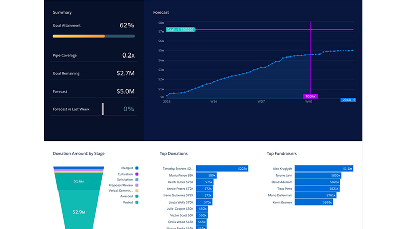
This dashboard is an example of the kind of analytics visualization you can achieve when using Salesforce Fundraising Analytics. You can track metrics like:
- How close you are to your goal
- How many dollars you have to collect to reach your goal
- Forecast for future donations
- Top donations and donors
- Top fundraisers
- Donation percentage breakdown by stage (pledged donations vs. posted donations, for example)
10. Bloomerang Fundraising Dashboard Example
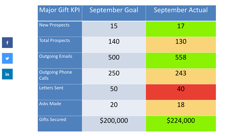
The following simple fundraising dashboard comes courtesy of Bloomerang. It is a very simple dashboard, but I like how they used color-coding to help you quickly visualize how close you are to your target goals.
Here is how to read the colors:
- If the box is green, it means you have achieved your target goal.
- If the box is yellow, it means you are close to achieving your goal – you have reached 90 percent of your target, but you are not quite there just yet.
- If the box is red, it means you have reached less than 90 percent of your goal. You need to do more work in this area.
Here is some of the data you can visualize using this chart:
- New prospects
- Total prospects
- Outgoing emails
- Outgoing phone calls
- Letters sent
- Asks made
- Gifts secured
For each of these metrics, you can quickly see what your goal was and what you actually achieved. The colors help you quickly spot the areas in which you need to improve.
Which Dashboard Should I Use?
None of these dashboards is inherently better than the others. Some of them focus more on the actual cash you brought in, while others take a broader perspective and look at things like awareness, volunteers who signed up to help, and so on.
You can definitely take one of the templates and use them; you can also design a dashboard that looks like one of these examples using the appropriate software. However, I would recommend looking at all the examples and building a dashboard that takes the best of each one.
For example, if you see data that is important to you that is included on one dashboard but not the others, include it on your own dashboard.
Here are some things you should be tracking in your fundraising dashboard:
- How many donations you received
- How many dollars you received in total
- What your costs were and how much net profit you got
- How much each donor donated, on average
- How much did you spend per dollar received and per donor
- How many new donors you got this month
- How many donors renewed their monthly automatic donations
- How many donors lapsed and did not renew their donations
- Where you got your donors from – which channels or events worked best
- How much of your total net profit is coming from major donors, and how much is coming from the majority of your donor base – the small-time donors
Here are some things you can learn from your dashboard:
- Which fundraising methods and events are not working
- Whether to focus on major donors or small-time donors
- Whether you need to spend more time trying to get donors to renew, rather than finding new donors
- Whether the number of donors helping out is increasing each month or decreasing
Without a dashboard, all of these metrics and data will be rather difficult to figure out. Fortunately, with a dashboard, you can put all of your data in one place so that you can quickly see how things are changing and where you need to improve.
Wrapping It Up
There are other fundraising dashboards out there online, but I found these to be the best ones. Some are complicated, while others are rather simple. However, all of them help you quickly gain important insights into the state of your nonprofit and its fundraising efforts.
Using these examples and templates, build a fundraising dashboard for your own business. Carefully choose which data points to include and where to place them on your dashboard, based on their importance. With a little work, you will be able to build a beautiful dashboard that will help you grow your nonprofit.